Module3_CourseMakeOver
In the following module, we will cover ways to enhance the look and appearance of your course.

Be careful. You might have great content but if your courses don't look good, it may not matter to the learners. Courses that are clean, fresh, and up-to-date allow you to significantly improve learner engagement and build trust.
So, your goal is:
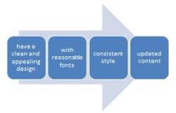
Image courtesy of Stuart Miles at FreeDigitalPhotos.net
While you may think your learner needs to know every facet, every nuance, and every aspect of the content you're presenting, they actually don't. The dreaded information dump is all too common and should be avoided at all costs. Putting less on the screen has definitely more impact. By leaving more white space and removing a lot of content that should really be placed on another screen, you give your learners a chance to guide themselves so they are more comfortable finding just what they need.
Think about our learning goals for a moment. Keep information focused on the course objectives. It's simple: if content doesn't support your objectives, cut it out.
1. Streamline the content by removing redundant and overly technical information.
2. Chunk-up your content. The shorter you can make it the better. When presenting text, make it in short, clearly focused modules.
3. Use white space to separate concepts and emphasize importance.
4. Rank and prioritize content.
5. Use graphics to visually represent more complex topics and information instead of text.

Image courtesy of Vicki Dunnam
 A good place to start making your course more intuitive is by organizing it logically and coming up with a simple page by page content outline.
Storyboarding is a great way to achieve this. Storyboarding is the process of visual thinking and planning what your course will look like before you start designing the course in your LMS. Placing your ideas on storyboards and then arranging the storyboards on the wall or using storyboarding software will be beneficial in seeing your course and maybe rearranging it before you start putting it together in your LMS. This helps to find loopholes or fine-tune your course. The main goal of using a storyboard is to give a blue print for the course with every detail.
Keep in mind the following elements when structuring your course effectively:
1. Navigation must be intuitive and simple to use. It must be clear to the learner what topics are featured and navigation to those topics must be seamless.
2. Add a simple menu or table of contents so learners can quickly find the relevant information and navigate efficiently to different modules and screens within the course.
3. Group content into logical modules (avoid creating modules that exceed 8-10 pages).
4. Provide "breadcrumbs." This is a technique that allows users to easily find their way back to the main menu after they have been navigating through your course. It's essential that users are able to find their way throughout the navigation of the course.
5. All topics and content items that are featured within a course must be readily apparent. Make your headlines and titles stand out--they introduce the screen and let the learners know what they are about to look at.
Image courtesy of Stuart Miles at FreeDigitalPhotos.net
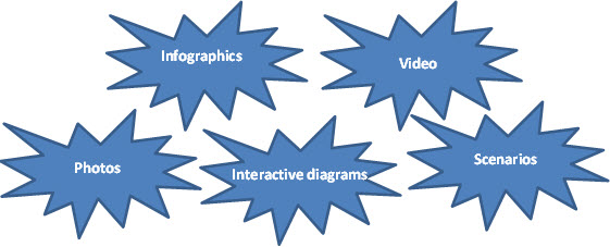 The material to be learned should be presented using not just text, but also graphics, figures, and pictures. Certainly, one of the easiest ways to break up a chunk of content is to include visual content into your course. A good rule to follow is keep things simple without overdoing or making more complicated. Sure, you want to add some sizzle and a touch of dazzle to your design as you rework the course, but don't take things so far from the original that you distract and confuse learners instead.
1. If you have a lot of dull information you can convert it into a scenario. You can create scenarios that relate to the learner's context to help them understand how they can react in a given situation.
2. Animated graphic elements are great. Animations go from simple text animations, to animated characters. Use them for things like step-by-step procedures, assessments or interactive material.
3. If you're showing a social or interpersonal skill, a video can help your learner connect with examples. Specially, short clips are very effective and easily digested by learners. Sometimes a short 2 minute video can offer the learner a quick way to explain a concept, idea, or solution that 500 words cannot convey.
4. Transform boring and information-heavy courses into interesting sets of stories. Show learners pictures that simplify complex concepts. Ideally, you'll be able to obtain an emotional reaction, because that way the content will be much more memorable.
5. More than just photos, remember you can create your own diagrams and infographics. Or even use simple objects like arrows for focus.
With most people having a fast connection to the Internet, why do eLearning course developers still deliver simple click-n-read Powerpoint Presentations? Come on!! Let's see some videos, animations, scenarios, simulations, live video chats, etc. Use your creativity! You'll reap rewards if you keep the eLearning modules or sections as short as possible (three minutes or less)
 1. Go beyond facts
Do not just put words on a screen. You need to change how the learner thinks and acts rather than just spill facts. Learners get easily bored when you bombard them with numbers, heavy paragraphs, and too much factual information. Avoid this by getting more creative and experimental. Start by transforming those unnecessary bullet lists into interactions. Or you can even stick with the facts but weave a story around them. Even a simple approach like this is more engaging than plain text.
 2. Experiment with different formats
People learn in different ways. Some do just fine reading content and can learn everything that way. But for those who may be more visual learners, including visual content that will help you illustrate points is a huge benefit to your content. When a boring topic is tough to follow, visuals make it easier to grasp.
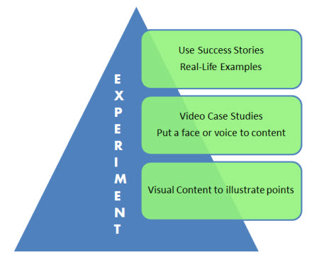 Also, success stories, real-life examples, and video case studies are other types of content assets that are not only easy to absorb but also a lot more personal than the typical content. With video or audio especially, you can put a face or a voice to the content and if done right the conversational, informal style can be easy for learners to relate.
Image courtesy of Vicki Dunnam
 3. Make it personal.
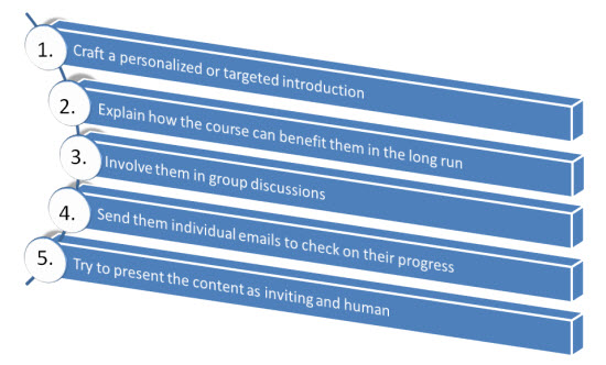
You can't simply motivate learners by offering non-personal incentives. The motivation has to come from within. It has to be personal. Review your material once again and ask how it will affect them. Are your objectives and expectations clearly outlined in the introduction? Make sure all of these have a personal impact. Learners should also be able to get feedback on a timely manner.
 4. Keep away from jargon
Your job as a course developer is to engage learners and encourage them to complete the course. This is only possible when you use words that are easy to understand, in a conversational and friendly tone. More importantly, avoid "business speak" or a tone that sounds trite, pretentious and confusing. Also, check your tone of voice, if it sounds forced, revise it and make sure the sentences flow naturally.
 5. Think in terms of usefulness
Your material is limited. It has to be. You can't include everything you find amusing in it. that's why every paragraph or element in your course should serve a purpose. Funny videos and catchy images are great but if they don't provide actionable information, then they don't deserve the attention of busy learners.
Make your learners DO things. Focus on what the learner needs to be able to do at the end of the day. Have the learners do something with the information. for example, give them something they can use, like problem-solving content.
|
Promise it will be quick
|
|
Plan the structure of the course |
|
Your text needs to communicate in a second that the entire experience of taking the lesson will be something they can do quickly and painlessly. The way you name your lessons can help you out . Short sentences and paragraphs work great also. No one wants to read the Great American Novel in your courses. |
Before you begin, think: who is the audience, what is the purpose of the message and how will the learner use the information. |
List the topics which need to be covered. Make a note of the points you want to cover on each screen. Focus on the learning objectives - and bear them in mind as you write! |
|
Lively and relevant Most learners only skim on-screen text so keep it lively and relevant to the learner. For example, add subheadings for each main idea. The learners will be able to glance at the subheadings and pick out the main ideas. |
Use text responsibly Use text responsibly. Keep it to no more than six lines per screen and intermix it with other elements. Also, don't overdo your text animations. |
Be authentic
Make sure the language and detail is authentic. If you're in new territory, talk to subject matter experts and do the research to make sure you're comfortable with the dialogue and patterns of speech.
|
|
Use the Active Voice
Use active voice whenever possible. The active voice is more direct and engaging. The sentences are punchy and makes it clear who's doing what. Writing in the active voice gives energy to your content, which will keep your learners reading. |
Variety is important You can go beyond bullet point slides and vary the rhythm of your text. Ask questions, mix up the structure - use scenarios, give examples, tell a story. |
Be descriptive Headlines and titles should tell the learner what the course or module is about. Some people like to use humor, while others prefer to play it straight. It doesn't matter, as long as readers know what to expect. Readers want to know what's in it for them. A good title will tell them. |
|
Wrong or misplaced links They may either be in the wrong place or nowhere to be found. Links are important extensions of your course content. They point to additional resources or further explain a subject. Double check them by clicking each link. Make them clear specific, brief, and accurately labeled
|
Illegible typography This one might seem nit picky, but it is definitely not. Great typography is a huge part of a fluid user experience; and if yours is not set correctly, your going to be losing learners' attention quickly.
|
|
Lack of clear instructions
Vague instructions for quizzes and games confuse learners. This is especially important in highly interactive tasks (think drag-and-drop games) and situations where they need to interact with content on-screen. Instead of completing activities to help students check their progress, unclear instructions can frustrate them. |
Navigation is one of those things you must get right. Create a course that has a friendly direction, that includes the intuitive navigation people look for, and that's immediately clear to the learner what to do next. Buttons, Exit, Help, continue, Go Back - try to keep them simple!!
|
|
Grammar & Spelling errors
eLearning course developers are expected to master grammar and spelling. This is the most evident way of showing learners that you are dead serious about grammar and spelling. Proofread your copy. Make sure all text is accurate and free of typos. |
Slow loading media Nothing frustrates people more than an animated clock that says 'loading' and still does five minutes later. Consider your audience (you may have users with slow connections or older hardware). Be sure to optimize all of your media so that it loads quickly.
|
|
Videos or media not working
Many students rely on videos and interactive content. Why not? They are much more efficient in packing a ton of content in as little as five minutes. The problem is, videos are prone to glitches. Sometimes they play but are unable to sync accurately with the audio. Or they don't play at all. |
Incorrect labeling of graphics and charts These visual tools help simplify and organize content-heavy courses. Labeled incorrectly, they can misinform or confuse learners. Take a look at each name or number and edit them separately to make sure they are correct. |
You have successfully completed the Module 3 Course Makeover lesson module.
Apply the knowledge learned in the lesson module by completing activities, assignments, discussions, reflections, and/or feedback evaluations located in the Moodle course.
